In the era of smartphones, tablets, laptops, and everything in between, designing a website that performs seamlessly across devices is more important than ever. That’s where responsive and adaptive web design come into play. But what do these terms mean, and how do they differ? Let’s break it down and explore which approach might be the best fit for your needs.
What Is Responsive Web Design?
Responsive web design is an approach that ensures a website adjusts its layout and elements dynamically based on the screen size and orientation of the device. Using flexible grids, fluid images, and CSS media queries, responsive websites provide a consistent and optimal viewing experience regardless of whether you’re browsing on a desktop, tablet, or smartphone.
Key Features of Responsive Design:
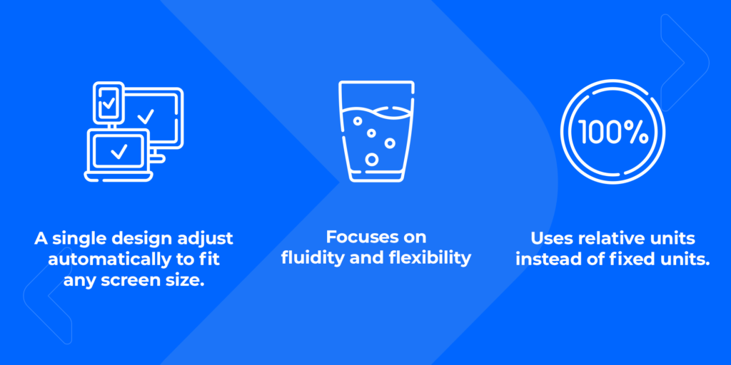
Responsive design is often seen as the gold standard for modern web development because it simplifies maintenance (one site for all devices) and improves SEO by providing a unified URL structure.
What Is Adaptive Web Design?
Adaptive web design takes a slightly different approach. Instead of creating a single layout that adjusts automatically, adaptive design delivers multiple fixed layouts tailored to specific screen sizes. When a user accesses the site, the appropriate layout is served based on the detected device type or screen resolution.
Key Features of Adaptive Design:
- Predefined layouts for specific screen sizes (e.g., 320px, 768px, 1024px, etc.).
- Allows greater control over the design for each device type.
- Often requires more development and maintenance effort, as multiple layouts must be designed and updated.
Adaptive design can shine in scenarios where control over user experience is crucial. For example, an e-commerce platform might use adaptive design to optimize product displays for mobile users while offering richer features for desktop users. Similarly, apps or websites with distinct workflows for different device types—like financial dashboards or gaming platforms—can benefit from tailored layouts.
While more resource-intensive, adaptive design is an excellent choice for projects where precise user experiences take priority over universal flexibility.

Tips for Designing a Great Website
Whether you choose responsive or adaptive design, several key principles should guide your approach:
- Prioritize User Experience (UX): Users should find your website easy to navigate, regardless of the device. Focus on intuitive layouts and clear calls-to-action.
- Optimize for Performance: Slow-loading websites can drive users away. Compress images, use efficient coding practices, and minimize the use of heavy scripts.
- Test Across Devices: Test your design on various screen sizes and resolutions to ensure consistent performance. Tools like browser emulators and real device testing are invaluable.
- Consider Accessibility: Accessibility is a crucial aspect of modern web design. Make your site usable for everyone, including individuals with disabilities. Incorporate features like:
- Alt text for images.
- Keyboard-friendly navigation.
- Sufficient color contrast for readability.
- Support for screen readers.
- Stay Future-Ready: Technology evolves quickly, so design with scalability and adaptability in mind. A flexible design approach ensures your site remains effective as new devices and standards emerge.
Why Accessibility Matters
Accessibility isn’t just a “nice-to-have” feature—it’s essential. An accessible website ensures that everyone, regardless of ability, can engage with your content and services. Beyond being the right thing to do, accessibility also offers tangible benefits:
- Broader Reach: 15% of the world’s population lives with some form of disability (source: WHO).
- Improved SEO: Many accessibility best practices, like descriptive alt text and semantic HTML, align with SEO principles.
- Legal Compliance: Depending on your region, accessibility may be a legal requirement under regulations like the ADA (Americans with Disabilities Act) or WCAG (Web Content Accessibility Guidelines).
The Bottom Line
Both responsive and adaptive design have their strengths, but the best choice depends on your specific goals, audience, and resources. Whichever path you choose, keep user experience, performance, and accessibility at the forefront of your strategy.
At Casa Pixel, we specialize in crafting modern, accessible websites that look great and perform flawlessly on every device.
